As the leaves begin to change and the air turns crisp, it’s time to refresh our spaces with the rich, inviting colors of fall. This season offers a palette of deep tones and soft neutrals that evoke warmth and comfort while reflecting nature’s stunning transformation. By thoughtfully selecting a color palette that combines these contrasting elements, you can create a sophisticated environment that feels both cozy and chic.
Deep hues such as burgundy, emerald green, and navy blue serve as stunning focal points, adding depth and drama to any room. Meanwhile, soft neutrals like cream, taupe, and dusty rose can provide balance, preventing your space from feeling overly dark or heavy. In this blog, we’ll explore the best upscale fall colors that are trending, tips for selecting a harmonious palette, and ideas for incorporating these mood-setting colors into your home.
The Allure of Deep Tones
Rich colors have an undeniable appeal, especially during the fall months. When selecting deep tones for your home, consider these sophisticated hues:
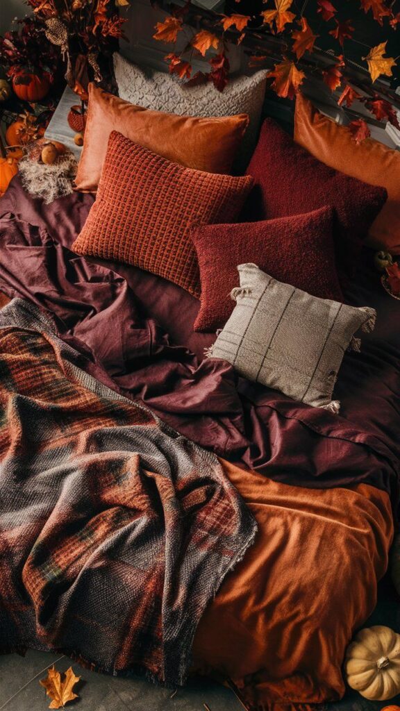
- Burgundy: A classic fall favorite, burgundy brings warmth and richness to your decor. It can be used in large furniture pieces like sofas or as an accent color through throw pillows and blankets. For example, a burgundy armchair paired with a neutral sofa creates a striking focal point in a living room.
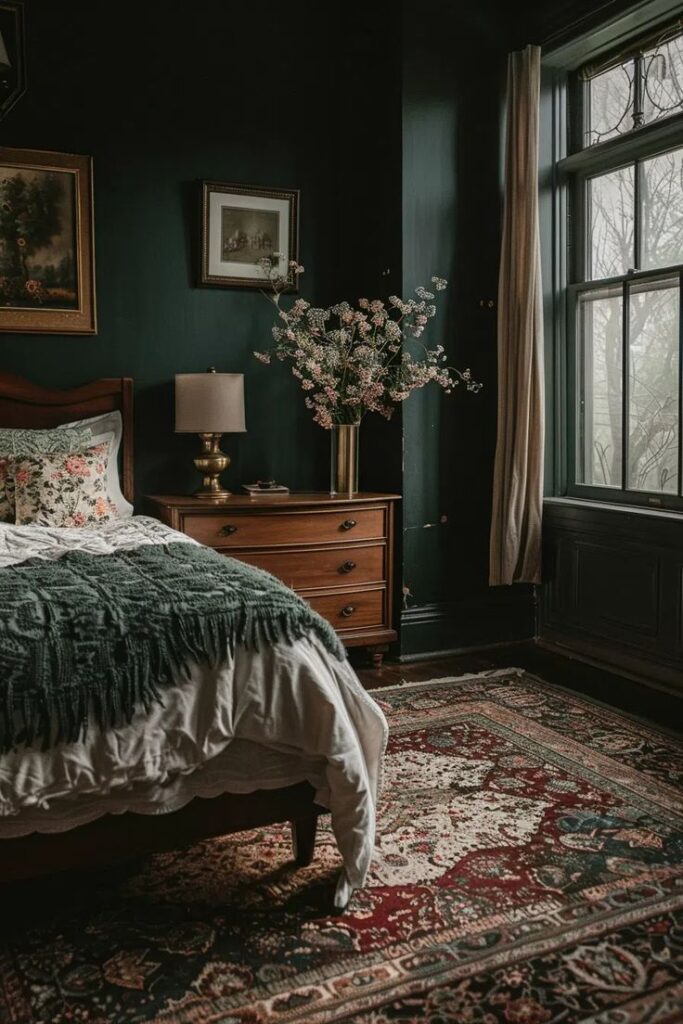
- Emerald Green: This deep green evokes a sense of nature and tranquility. Use it on an accent wall or in decorative accessories, such as curtains or vases, to create a striking contrast against lighter tones. For instance, emerald green curtains can add a touch of elegance to a room filled with creamy walls.
- Navy Blue: Timeless and elegant, navy blue adds a touch of sophistication to any space. Consider navy blue for furniture, such as a statement sofa, or artwork that features bold navy hues. An example could be a navy blue console table against a light neutral wall, creating an eye-catching centerpiece.
The Elegance of Soft Neutrals
While deep tones set the mood, soft neutrals provide a calming backdrop that balances the richness of the deeper hues. Consider these chic options:
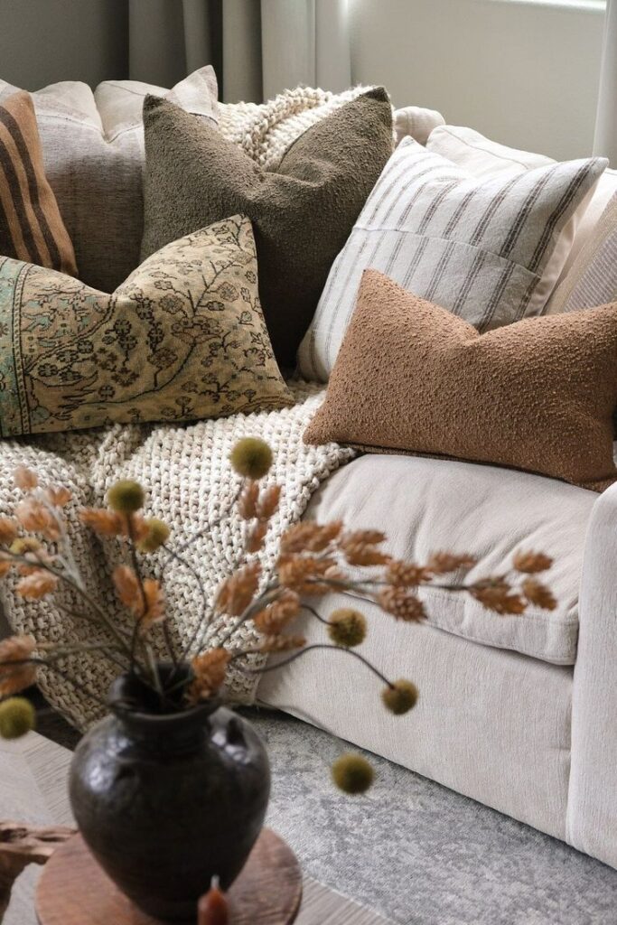
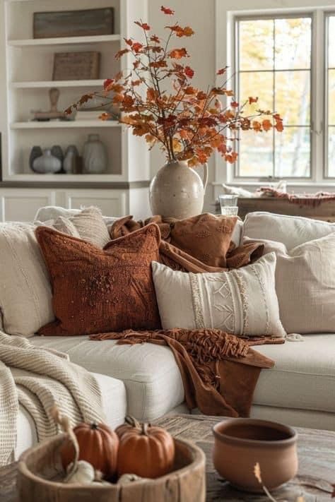
- Cream: A versatile color that adds warmth without overpowering. Use cream for larger areas like walls or sofas to keep the space feeling light and airy. For example, a cream-colored sectional can serve as a beautiful foundation for a room adorned with burgundy and gold accents.
- Taupe: This soft, earthy shade complements a variety of colors and can serve as a perfect transition between deep tones and brighter accents. A taupe rug can ground a space filled with vibrant colors, creating a seamless flow between different design elements.
- Dusty Rose: A gentle blush that adds a hint of color without being too bold. It works beautifully with deep greens and burgundies, creating a harmonious palette. For instance, incorporating dusty rose cushions or artwork can soften the impact of darker furniture.
Integrating Deep Tones with Soft Neutrals
To create a harmonious and balanced look, integrating deep tones with soft neutrals is essential. Here are some strategies to help you achieve this:
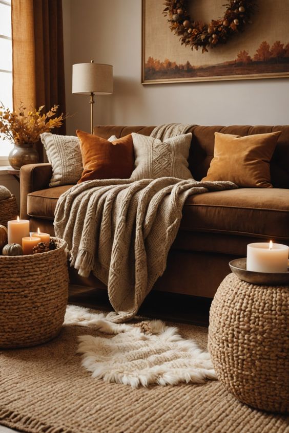
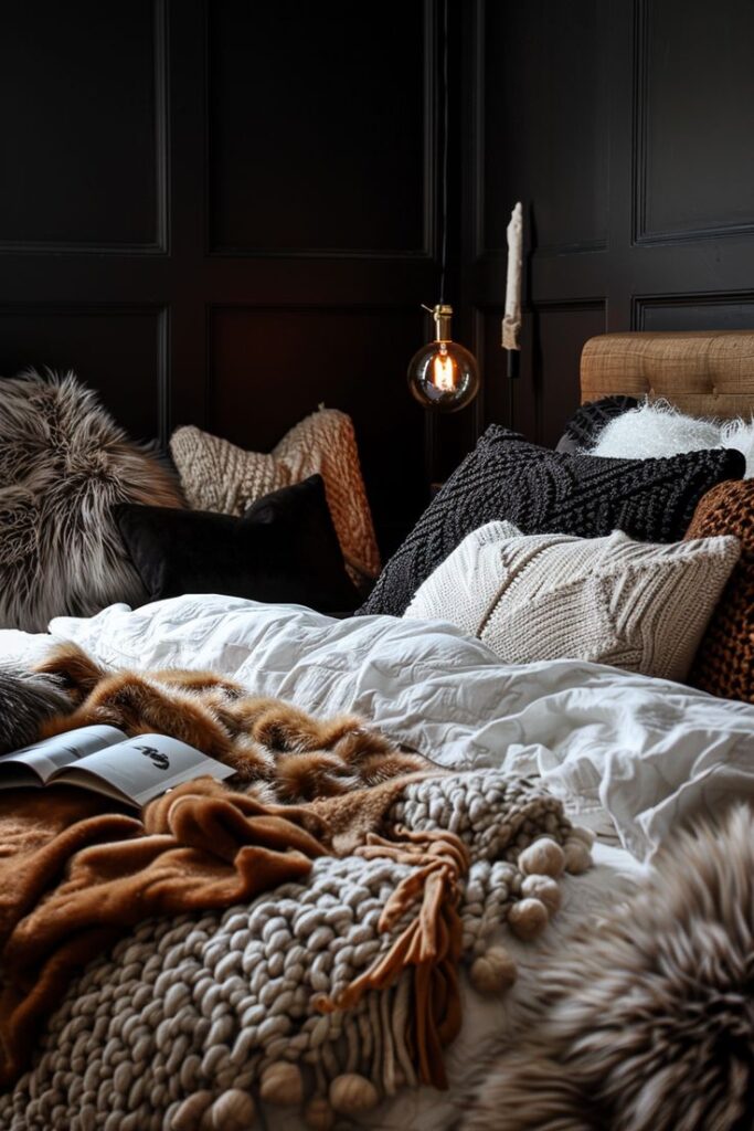
- Layering Textures: Combine deep-colored textiles with soft neutrals in various textures to create visual interest. For example, a velvet burgundy throw paired with a cream knit blanket on a taupe sofa can add depth and warmth to the room.
- Accent Walls: Consider painting one wall in a deep tone while keeping the other walls neutral. This technique draws the eye and creates a focal point without overwhelming the space. For instance, a navy blue accent wall behind a cream-colored bed can create a striking backdrop.
- Furniture Pairings: Select furniture pieces that combine both deep tones and soft neutrals. A sofa in a deep green fabric with light-colored throw pillows can bridge the two palettes beautifully, creating a cohesive look.
- Artwork and Decor: Use artwork that features both deep and neutral colors to tie your palette together. For example, a painting with deep reds and soft taupe tones can serve as a unifying element in your decor.
- Seasonal Accents: Switch out seasonal decor items, like pillows and throws, to reinforce the color palette. For example, use deep-toned fall decor, like burnt orange or mustard yellow, alongside soft neutrals for a balanced autumn vibe.
Tips for Selecting Your Fall Color Palette
When it comes to creating a balanced look with deep tones and soft neutrals, consider the following tips:
- Start with Inspiration: Browse Instagram and Pinterest for mood boards that feature your desired colors. Look for rooms that resonate with you and take note of how the colors interact. Save your favorite images as a reference when selecting your palette.
- Create a Color Swatch: Once you’ve identified a few favorite hues, create a color swatch by collecting paint samples or fabric swatches. This visual aid will help you see how colors play together in your space. Consider pinning your swatches to a board and displaying them in the room you’re decorating.
- Use a Dominant Color: Choose one deep tone to serve as the dominant color in your space. This will create a focal point and establish the overall mood of the room. For example, if burgundy is your dominant color, you could paint an accent wall in that shade and then decorate with complementary colors.
- Add Neutrals Strategically: Incorporate soft neutrals to balance the richness of the deep tones. Use them for larger items, such as sofas or rugs, to keep the space feeling grounded. A light-colored rug can help anchor darker furniture, creating a cohesive look.
- Accessorize with Accents: Introduce smaller accents in contrasting colors—like metallics or bright hues—to add interest and depth to your design. For example, gold or brass accents can add a touch of luxury to a space dominated by deep tones.
Bringing It All Together
To tie your color palette together, consider the following products and ideas that embody the season’s mood-setting colors:
- Textiles: Opt for deep-colored throw blankets and pillows, mixing textures like velvet and wool for added richness. Look for neutral area rugs that can ground the space and create a cohesive look. For example, a plush burgundy throw paired with a cream sofa adds both comfort and style.
- Artwork: Invest in artwork that incorporates your chosen palette, featuring both deep tones and soft neutrals. A painting that includes shades of emerald green and dusty rose can serve as a stunning focal point in your living room or bedroom.
- Furniture: Choose furniture pieces in deep colors, such as a burgundy accent chair or an emerald green velvet sofa, and pair them with neutral side tables or ottomans. A navy blue coffee table with soft taupe upholstered chairs creates a sophisticated yet inviting atmosphere.
- Plants: Incorporate indoor plants to bring life into your space. Plants with dark green foliage can complement your color scheme while adding a refreshing touch. Consider a tall indoor plant in a deep burgundy pot for a striking visual.
Final Thoughts
Selecting the right mood-setting colors for fall can transform your space into a haven of comfort and elegance. By blending deep tones with soft neutrals, you can achieve a balanced and sophisticated look that reflects the beauty of the season. Let your creativity flow and embrace the rich hues of fall to create a warm, inviting atmosphere in your home.